Create a Custom Field
Custom fields let you extend any model in Deepser with additional data. You can access the Custom Fields module from System > Custom Fields to create new fields, configure element types, and manage events. This guide covers the model view, field creation process, and available element types.
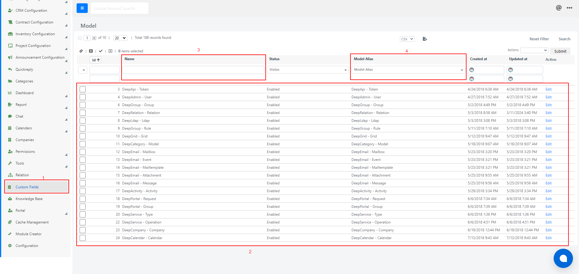
Model Overview
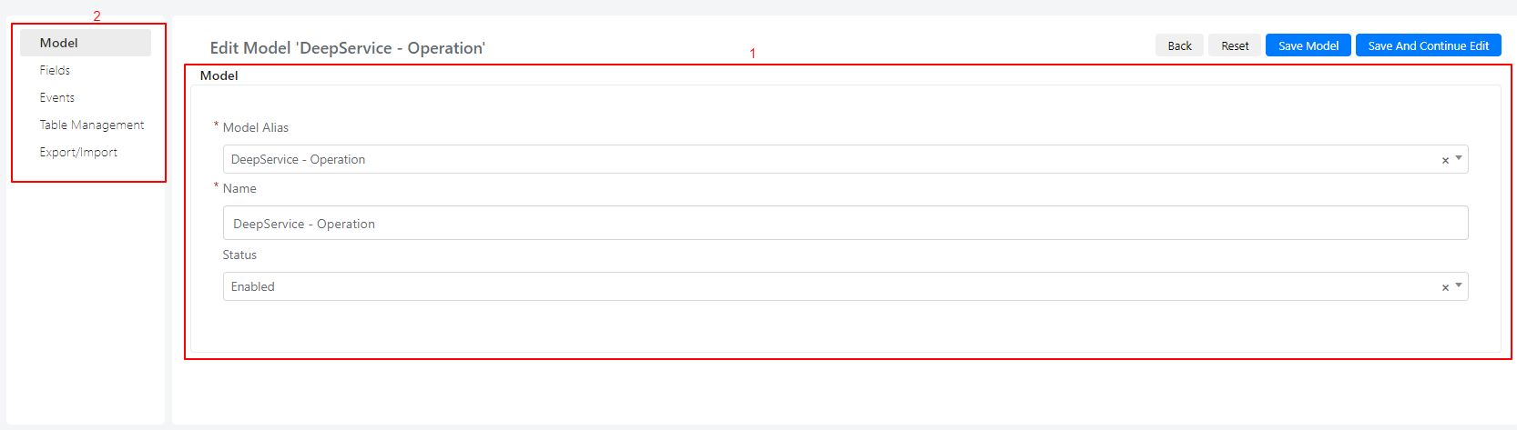
When you click a model in the grid, the model detail window opens. It contains the model details [1] and a side menu [2] with the following sections:
- Model -- current model information.
- Fields -- create new fields and edit existing ones.
- Events -- create new events or edit existing ones.
- Table Management -- manage the database table directly.
- Import/Export -- import or export fields and events between environments.
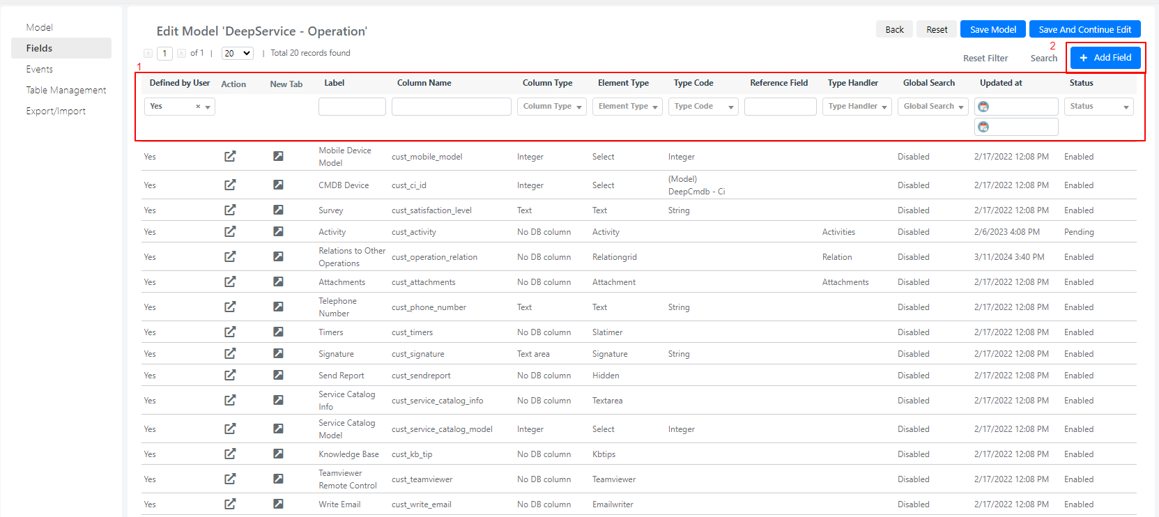
Browse and Filter Fields
The Fields tab lists all fields for the selected model. You can filter the list by:
- Defined by user
- Label
- Column name
To edit an existing field, click its row, the "New Tab" icon, or the "Action" icon. To create a new field, click Add Field [2].
Add a New Field
- Click the Add Field button. The field creation form appears.
- Fill in the fields described below. Some fields change dynamically based on the selected element type.
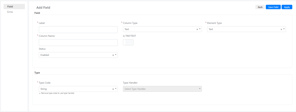
Field Section
| Field | Description | Note |
|---|---|---|
| Label | Display name of the field. | |
| Column Type | Database column type. | Available types: Text, Long Text, Integer, Decimal, Date, Do not create a DB column (for display-only fields). |
| Element Type | HTML element rendered on the form. | Determines how the field appears and behaves. See Simple Element Types and Advanced Element Types for details. |
| Column Name | Database column name. | User-created fields automatically receive a "cust_" prefix. |
| Status | Controls when the field is created in the database. | Enabled: field is active and created in the database. Disabled: field is not active. Pending: field is created but not yet inserted in the database, useful for deferring DB changes to low-activity periods. |
Advanced Section
| Field | Description | Note |
|---|---|---|
| Global Search | Include this field in global search results. | Yes: adds the field to global search. No: excludes it. |
| Class | CSS class applied to the element on the form. | |
| After Element HTML | HTML code inserted after the element. | Used to override or extend the element's HTML rendering. |
| On Click | JavaScript event triggered when the element is clicked. | |
| On Change | JavaScript event triggered when the element value changes. | |
| Values | For Select fields, the list of values as a PHP array (key-value). | |
| Custom Element Data | Array retrieved from a custom source to populate the element. | For example, a call to an external REST API that populates a Select with values from external software. |
Additional metadata fields:
- Status -- whether this field will be used.
- Type Code -- the return type of the field when used inside Flow.
- After saving, the new custom field becomes available in the form template of the module entity.
Available Element Types
You can choose from the following element types depending on what data you need to store and how you want to display it.
-
Activity
-
Address
-
Approvalgrid
-
Attachment
-
Category
-
Checkbox
-
Color
-
Cronexpression
-
Date
-
Datetime
-
Deeppassword
-
Editor
-
Emailaddress
-
Emailgrid
-
Emailwriter
-
Grid
-
Rating
-
Relationgraphview
-
Relationgrid
-
Select
-
Signature
-
Inventoryitemgrid
-
Inventorymovementgrid
-
Invoicegrid
-
Invoicerelatedmodelgrid
-
Kbtips
-
Label
-
List
-
Multiselect
-
Number
-
Password
-
Percentage
-
Price
-
Progressbar
-
Qrcode
-
Radio
-
Radios
-
Task
-
Teamviewer
-
Text
-
Text area
For detailed configuration of each element type, see Simple Element Types and Advanced Element Types.