Simple Element Types
Simple element types provide straightforward input controls for custom fields in Deepser. Each type defines how the field is rendered on the form and what kind of data it stores. This reference covers every simple element type with its view, configuration, and extra options.
Attachment
View
Attachment is used to store different files.
The field will be displayed as follows:

Field Configuration
Column Type: Don't create DB column.
The extra tab changes with the following fields:
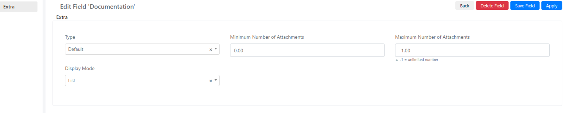
| Field | Description | Note |
|---|---|---|
| Type | File type of the attachment, default equals all types | |
| Minimum number of attachments | ||
| Maximum number of attachments | where -1 is unlimited | |
| Display mode | Sets the display of the elements inside the form, grid or list. |
Category
View
Category is used to define the category of the current entity. This field contains various select fields, each connected to the Category model.
If you select one in the first dropdown, you will be prompted with another select containing the children of that selected category, and so on until the selected category has no children. You can add and edit categories in System > Categories. The rendering on the form will be as follows:

Field Configuration
Column Type: Don't create DB column.
Checkbox
View
Checkbox is an element type that is rendered in two ways inside the form.
Checkbox Render

Toggle Render

Field Configuration
Column Type: Integer or Text
When you select this element type, new fields appear in the "Extra" tab:
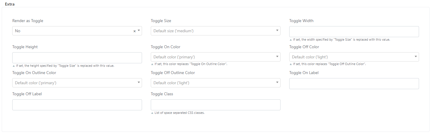
| Field | Description | Note |
|---|---|---|
| Render as Toggle | Whether the element will be rendered as a toggle instead of a checkbox inside the form | |
| Toggle Size | ||
| Toggle Width | ||
| Toggle Height | ||
| Toggle On Color | Color of the toggle when it is switched on | |
| Toggle Off Color | Color of the toggle when it is switched off | |
| Toggle On Outline Color | Color of the outline when the toggle is on | |
| Toggle Off Outline Color | Color of the outline when the toggle is off | |
| Toggle On Label | Label of the toggle when it is switched on | |
| Toggle Off Label | Label of the toggle when it is switched off |
Color
View
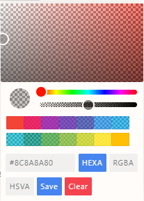
This field is used to select a specific color and save the value as HEXA, RGBA, or HSVA.
The rendering inside the form is as below:
Field Configuration
Column Type: Text
Date and Datetime
View
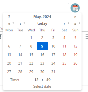
Date and Datetime formats render a calendar where you can select the desired date. In the case of Datetime, time inputs appear below the calendar.
The rendering for Date is:

The rendering for Datetime is:
Field Configuration
Column Type: Date
Editor
View
Editor is a field used to store large texts and is associated with a text area column type.

Field Configuration
Column Type: Text Area
When you select this element type, the following new fields appear inside the Extra tab:

| Field | Description | Note |
|---|---|---|
| WYSIWYG (Advanced Editor) | Turns the text area field into a rich text editor where you can change the design of the text | |
| Mentions | Allows end users to mention someone | |
| Quick Replies | Allows you to write a generic answer. To use quick replies you need to enable the advanced editor. To create new quick replies, go to System > Quickreply module configuration | |
| Browser Spell Check | Checks for spelling errors |
These fields are set to "No" by default.
File
View
By selecting the File type, the element, once added to the form, will allow the insertion of a file.
The file will be automatically stored in a dedicated folder. Only the path of the file on the server will be stored in the field you are configuring.

Field Configuration
Select the Text option as the Column Type.
Label
View
Label is the simplest field type. This field is used to display a label or text. The text displayed is the label of the field.

Field Configuration
Column Type: No DB column
List
View
List is used to create a select field connected to a selected list.

Field Configuration
Column Type: Text (text or alphanumeric key) or Integer (numeric key)
When you select this element type, a new field called List Code appears inside the Field tab, which connects to the selected list.
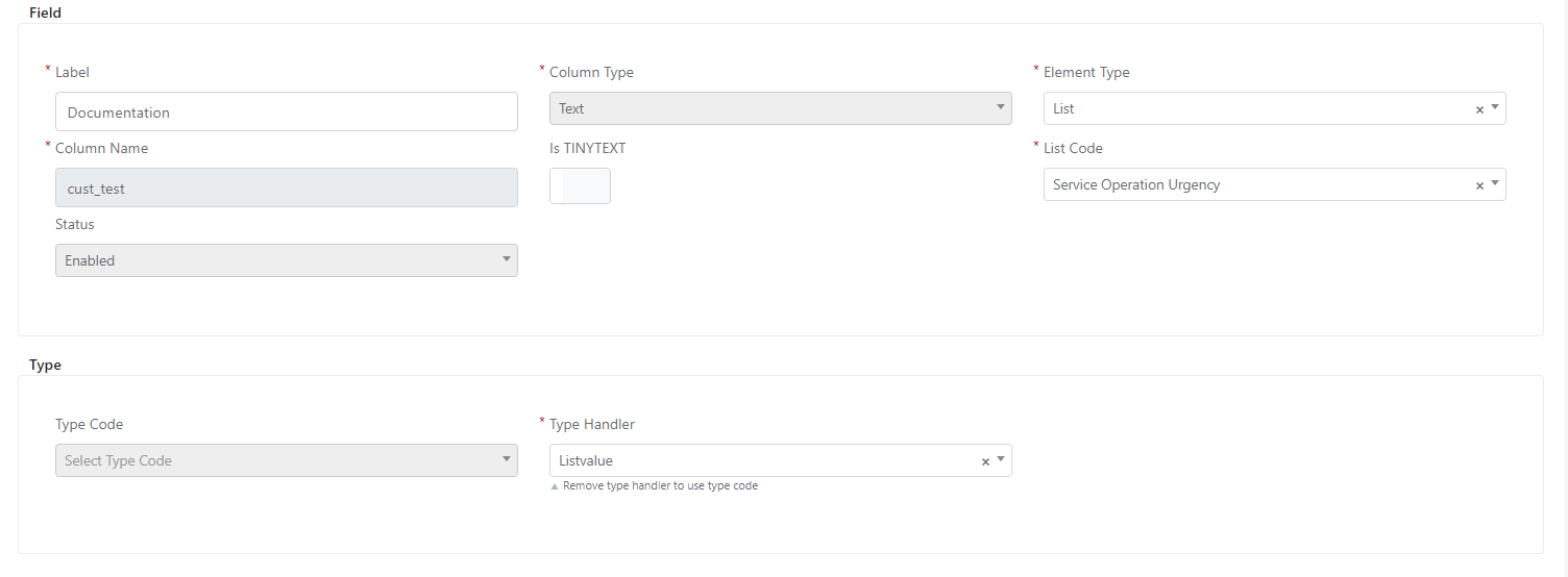
All values of the selected list are shown in the select field rendered in the form.
If you go to the "Extra" tab, you will see three new fields:

| Field | Description | Note |
|---|---|---|
| Placeholder | Placeholder shown when nothing is selected | |
| Group Filter | When set to yes, this applies the group filter that each value has set inside the list | |
| Model Filter | When set to yes, this applies the model filter that each value has set inside the list |
Number
View
Number is an element displayed as a number input field where you can type only numbers without a leading zero. The rendering is as follows:

Field Configuration
Column Type: Integer
If you go to the "Extra" tab, you will see one field:

| Field | Description | Note |
|---|---|---|
| Decimal Precision | Indicates the number of decimal places |
Password
View
Password is a simple input field of type password.

Field Configuration
Column Type: Text (password can be alphanumeric).
Percentage
View
Percentage is an element rendered as a number input field that holds decimals, with an extra element below it [%] indicating that this field is a percentage.

Field Configuration
Column Type: Decimal
Price
View
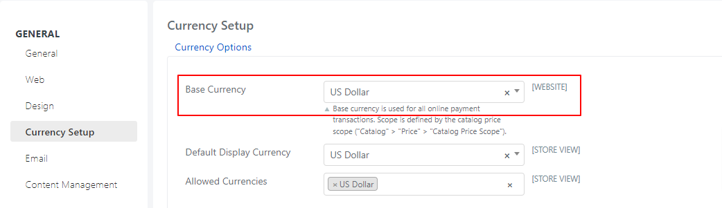
Price is an element rendered as a number input field that holds decimals, with an extra element below it [USD] indicating that this field is a price.

Field Configuration
Column Type: Decimal
You can select the currency in System > Configuration > Currency Setup.
Radio
View
Radio is an input element of type checkbox with a different style.

Field Configuration
Column Type: Integer
Radios
View
Radios is the extended version of the radio element type.
For example, with the following configuration, all the Service Operation statuses will be listed as radio buttons, and you can select only one.

Field Configuration
Column Type: Text or Integer
If you go to the "Extra" tab, you will see three fields:

| Field | Description | Note |
|---|---|---|
| List Code | Indicates the list that will be displayed | |
| Columns | Indicates how many columns the values will be distributed across | |
| Responsive | Sets whether the element will be responsive to different screen widths |
Rating
View
Rating is an element displayed as stars. The value of this field is the number of stars selected.

Field Configuration
Column Type: Integer
In the "Extra" tab you will see the following field:

| Field | Description | Note |
|---|---|---|
| Max Value | Maximum value that indicates the maximum number of stars displayed |
Signature
View

This field has two main components displayed inside the form:
- The "+" button is used to create a new signature. When clicked, it opens a modal where you can draw the new signature.
- The clear button is used to empty the image holder.
Once the signature is inserted, a small image will appear containing the signature.

Field Configuration
Column Type: Text Area
Teamviewer
View
This type is used to connect to the TeamViewer application. It is rendered as a button, and when clicked, the TeamViewer configuration window will pop up. If already configured, the TeamViewer application will launch. Beside this button, you have a refresh icon used to refresh the connection.

Field Configuration
Column Type: Don't create DB Column
Text and Textarea
View
These element types are used to store text.
The rendering for Text is:

The rendering for Text Area is:

Field Configuration
Column Type: Text or Text Area (depends on the length of the text)